The Psychology of Color
Beyond Aesthetics: How to Use Color Psychology to Shift Your Home’s "Aura"
12/28/20256 min read
More Than Just a Pretty Shade
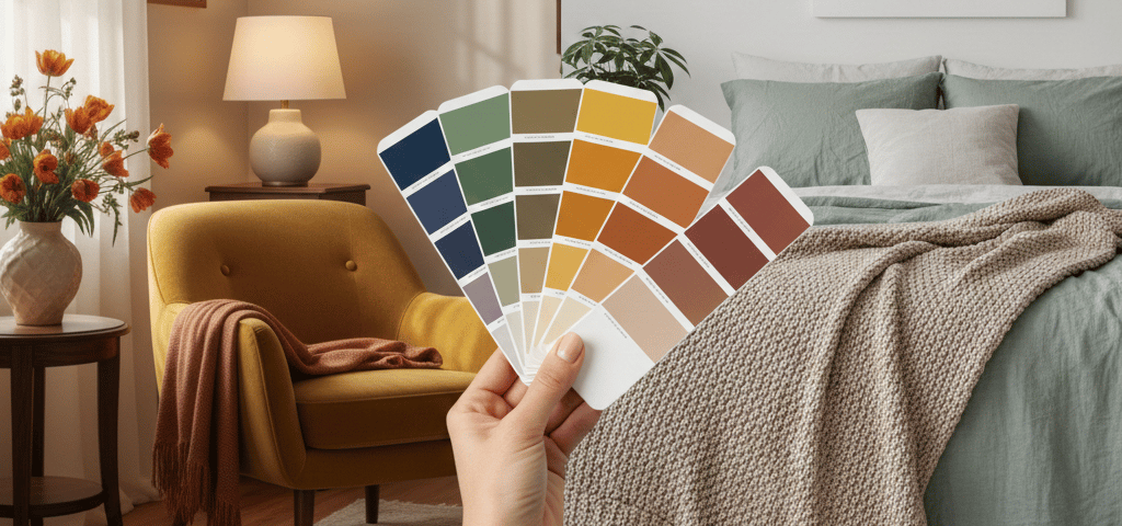
Have you ever walked into a room and immediately felt a sense of calm, or perhaps a sudden burst of unexplained anxiety? It isn’t just the furniture or the layout—it’s the color. Color is a silent language that speaks directly to our subconscious. In the MyHomeAura philosophy, color isn't just about what looks "trendy"; it’s about curating the energy you want to live in every day.
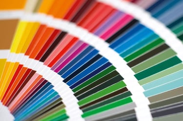
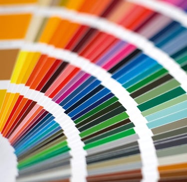
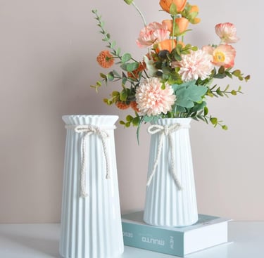
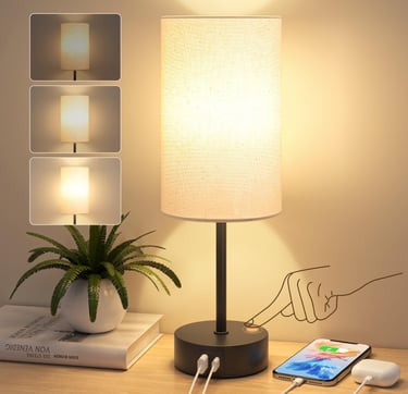
Featured Product:
The perfect starting point for any home decorator.
🎨 The "Active" vs. "Passive" Aura
Before picking up a paint swatch, you must ask yourself: What is the intention of this room? Colors generally fall into two psychological categories:
Active Colors (Warm Tones): Red, orange, and yellow are stimulating. They increase heart rates and encourage conversation. These are perfect for "high-energy" zones like the dining room or a creative home studio.
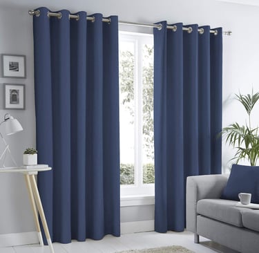
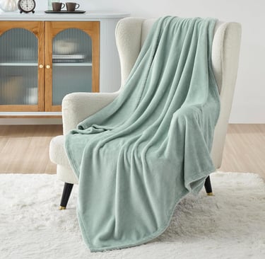
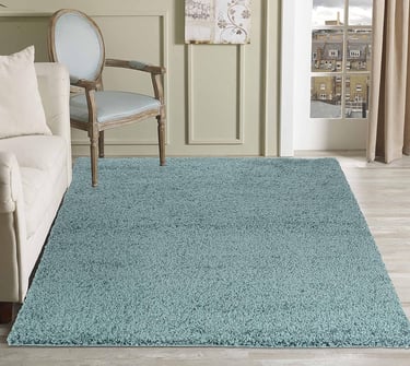
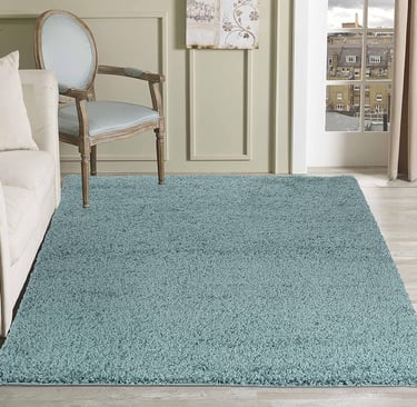
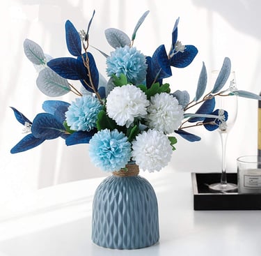
Passive Colors (Cool Tones): Blue, green, and light purple are sedative. They help with focus and relaxation. These are your "sanctuary" colors, best reserved for bedrooms, bathrooms, and meditation corners.
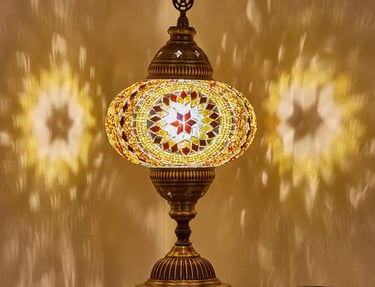
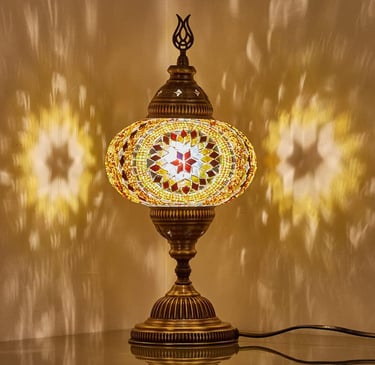
Product for Active Spaces:
Adds warmth and social energy to your living room.
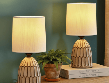
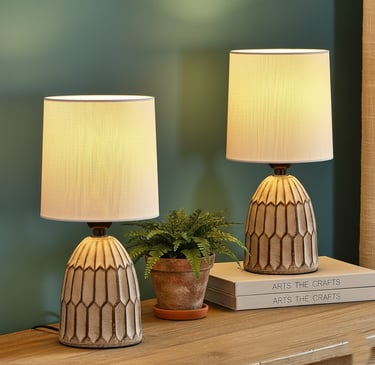
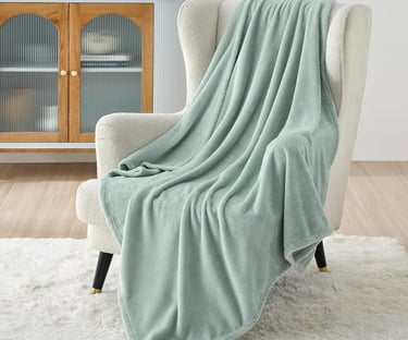
Creates a soothing, colorful ambiance.
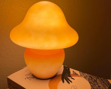
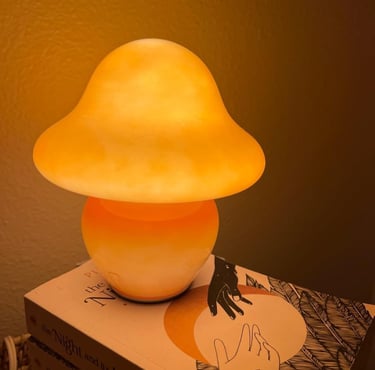
Diffuses a warm, gentle light for a cozy atmosphere.
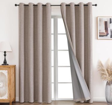
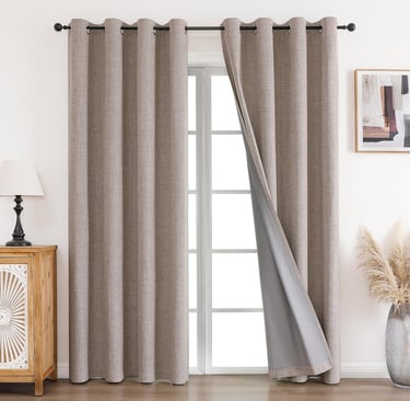
Product for Passive Spaces:
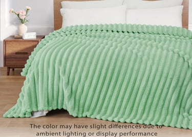
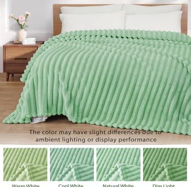
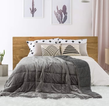
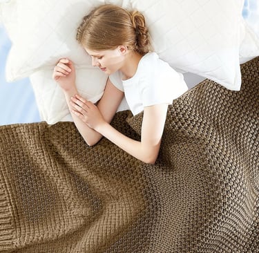
Immediately grounds your bedroom for a deeper sleep.
Regulates room temperature and blocks harsh light for year-round comfort.
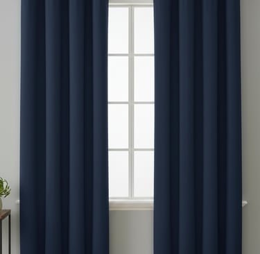
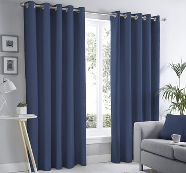
Bold navy tones that instantly elevate your room with a modern, polished look.
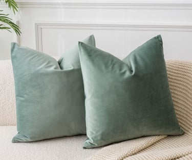
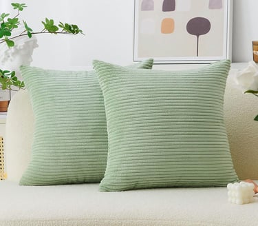
🌿 The "Sage Sanctuary": Why Green is Trending
There is a reason "Sage Green" has taken over interior design. Green sits in the center of the color spectrum, making it the most restful color for the human eye. It represents growth and renewal. By incorporating green into your home’s aura, you are literally bringing the "healing power of nature" indoors, which reduces cortisol levels and helps you decompress after a long workday.
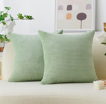
Product Pick:
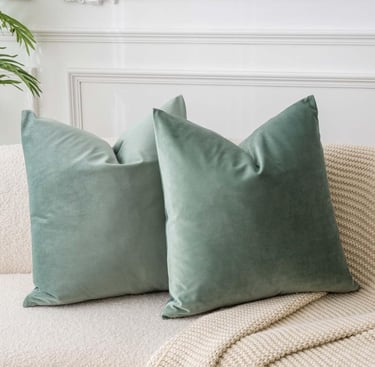
Sage Green Velvet Throw Pillow Covers
An affordable way to test the calming effects of green.
Luxe sage velvet that adds a soft, sophisticated touch to elevate your room.
Provides instant warmth while effortlessly elevating your room’s comfort.
Exceptionally soft and fluffy textures that bring a cozy feel to elevate your room.
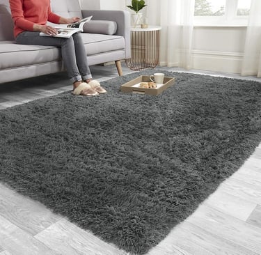
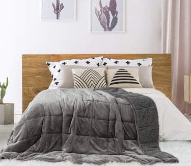
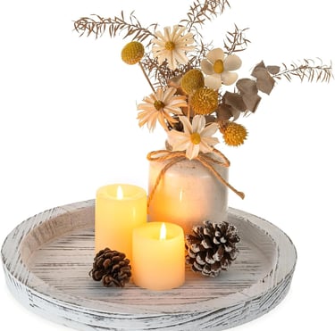
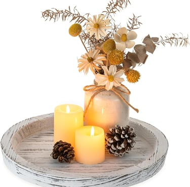
☁️ The Neutral Trap: Finding Peace in Greige
Many people stick to all-white or all-grey homes to play it safe, but this can often lead to a "clinical" or "cold" aura. To avoid this, we recommend moving toward Warm Neutrals—think oatmeal, sand, and "greige." These shades provide the cleanliness of white but with an added layer of psychological warmth that makes a house feel like a home.
Product Pick:
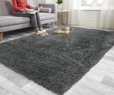
Deep, soft pile that adds luxurious warmth and comfort to elevate your floor.
Ultra-soft shaggy fibers paired with a non-slip backing to elevate safety and style.
Durable braided textures that effortlessly elevate any rustic or modern space.
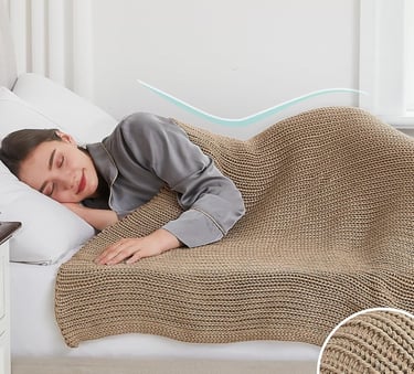
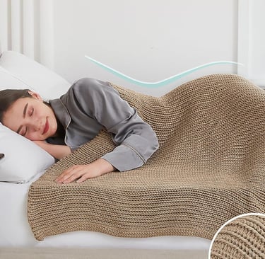
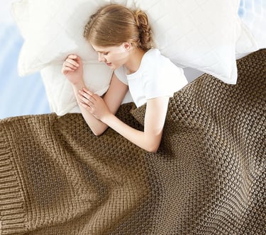
Designed for deep relaxation to elevate your sleep experience.
Hand-knitted weight that reduces stress and elevate nightly comfort.
Cooling Chunky Knit Heavy Blanket
A stylish, oversized knit that provides calming pressure.
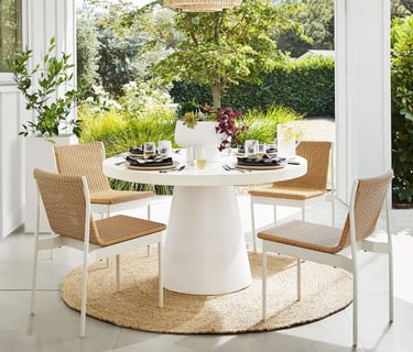
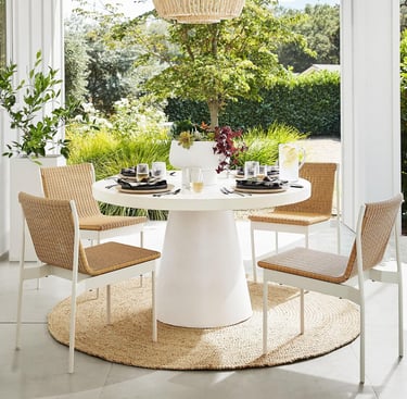
🖌️ The Designer’s Secret: The 60-30-10 Rule
If you’re worried about a color being "too much," follow this professional formula to maintain a balanced aura:
60% Dominant Color: This is your background (walls, large rugs). Keep this neutral or soft.
30% Secondary Color: This provides the mood (curtains, accent chairs, bedding).
10% Accent Color: This is your "pop" of energy (pillows, candles, artwork). This is where you can be bold without overwhelming the senses.
Product for the 60% (Dominant):
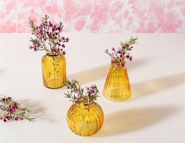
A small pop of "joy" that won't overwhelm your space.
Catches the light to bring a bright, cheerful pop of energy to elevate your room.
Product for the 30% (Secondary):
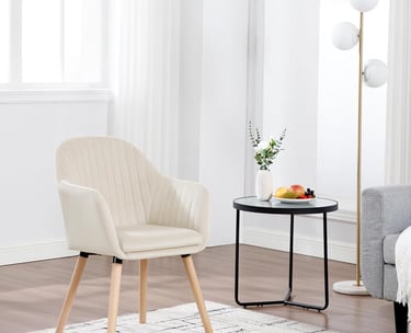
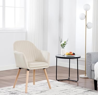
Tailored fabric and plush seating that instantly elevate your room's comfort.
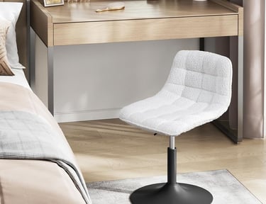
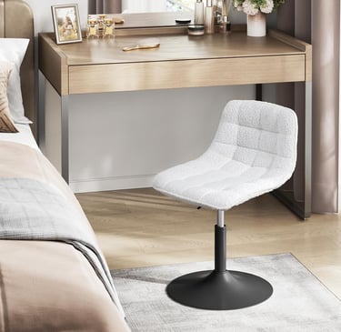
A sleek, compact silhouette designed to elevate your morning routine with style.
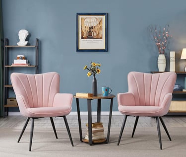
Iconic wrap-around design that brings a bold touch to elevate your space.
Product for the 10% (Accent):
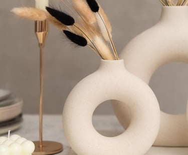
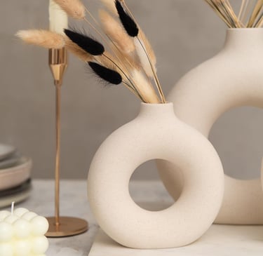
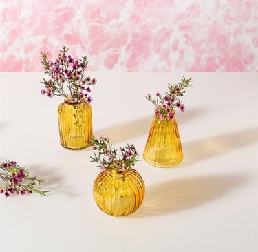
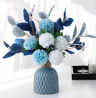
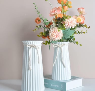
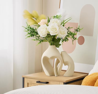
Bring nature indoors to effortlessly elevate your room.
White Centerpiece Candle Holder
Creates a striking focal point to elevate your dining or coffee table.
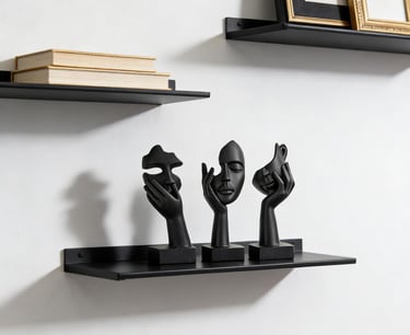
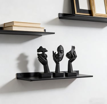
Adds a layer of modern culture to elevate your bookshelf or mantel.
✨ Aura-Enhancing Essentials
To help you get started on your color journey, here are our top picks for adding intentional color to your space without a permanent commitment:
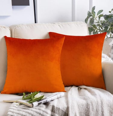
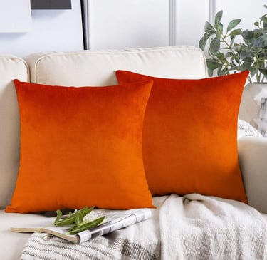
Sofa Velvet Burnt Orange Cushion
Provides a luxurious texture and a vibrant pop to elevate your room.
Perfect for testing the 10% accent rule.
Add a refined, minimalist touch to elevate your space.
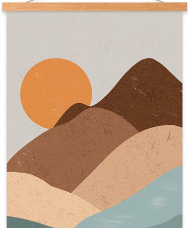
Beautifully display your art and instantly elevate your wall decor.
Brings a subtle, artistic touch to elevate your room with understated charm.
Warm glow to elevate your evening relaxation.
Summary: Your Color Roadmap
The "aura" of your home is a reflection of your inner self. Start small with one room, decide on the emotion you want to feel, and let color do the heavy lifting.